Design Data Management System
Intuit · 2016 – present
Treating design as data to accelerate and improve design system responsiveness and coherence
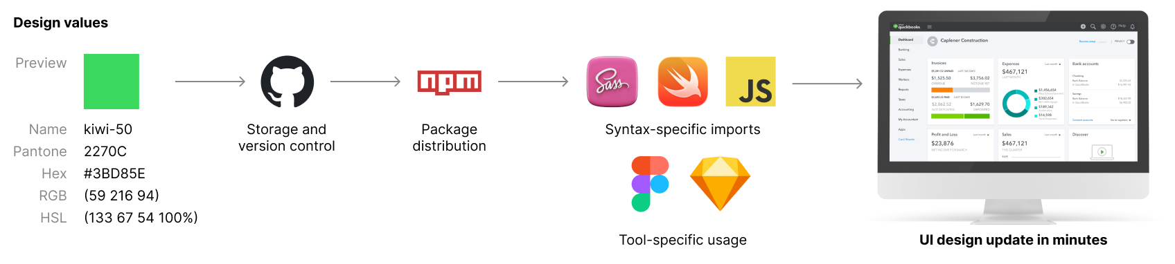
The Product
Design tokens at enterprise scale
A system for managing design tokens enabling design system scaling across web, mobile, and desktop applications.
Built on the principle of "design as data," it transformed how design decisions were stored, versioned, and distributed to engineering teams.
Before this system, design values were scattered across design files, codebases, and documentation. Costly manual synchronization was the norm.
With the introduction of this system, design values became collected and connected, from design tools to production codebases and observability systems.
My Role
Design Technologist
I built the prototype system in 2016 during my first weeks on the IDS team. The project quickly gained interest and momentum, and working with IDS engineers I architected the system and drove adoption.
The first version included multi-language multi-platform transformation pipelines, storage in Github, and distribution infrastructure (NPM, Artifactory).
Over the following years while others were leading the work, I continued to contribute to evolve the system's capabilities in response to organizational needs, including build-time compliance scanning, developer codemod tools, and enterprise-scale observability and governance tools.
Outcomes & Impact
Enterprise adoption, a decade in prod
The system was adopted by design system teams and thousands of developers across Intuit.
In 2018 the DDMS accelerated a complete visual refresh of the QuickBooks ecosystem, enabled via build-time observability and feedback.
The bet we made in 2016, that design should be managed as data, has since been validated twice over: design tokens became standard industry practice, and the system itself continues to run at Intuit today, a decade on, across its design systems and platforms.
My colleague Kelly Harrop presented the work at Figma Config 2022.
Insight
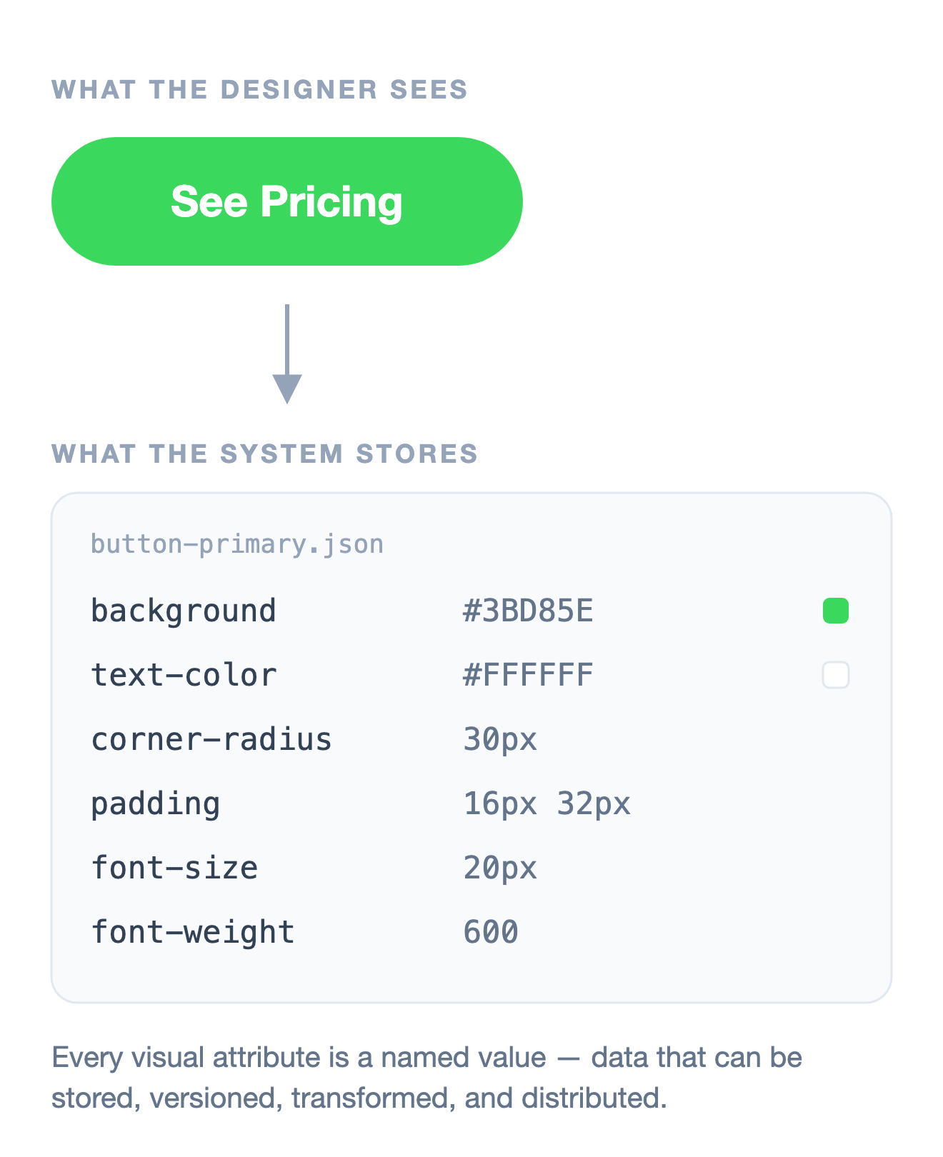
Design attributes can be treated as data
The key insight was simple but powerful: "Design as data."
Design Tokens are named variables that store visual design attribute values like colors, typography, and spacing.
The designs born in Figma (or at the time, Sketch) eventually become the information that shows up in code. That information, which represents the UI of a web, mobile, or desktop app, can itself be treated as data.
This realization unlocked a fundamentally new approach to managing design consistency at enterprise scale - treating design decisions as structured data that flows through a pipeline, rather than as static specifications passed between teams.
Design Tokens are now well established in the design systems community as a best practice for managing design attributes in a scalable, consistent manner. However, I believe this project was among the first to implement this approach at scale within a large enterprise organization, and I also believe that the future of design systems lies in treating design as data.
Implications
What becomes possible when design is data
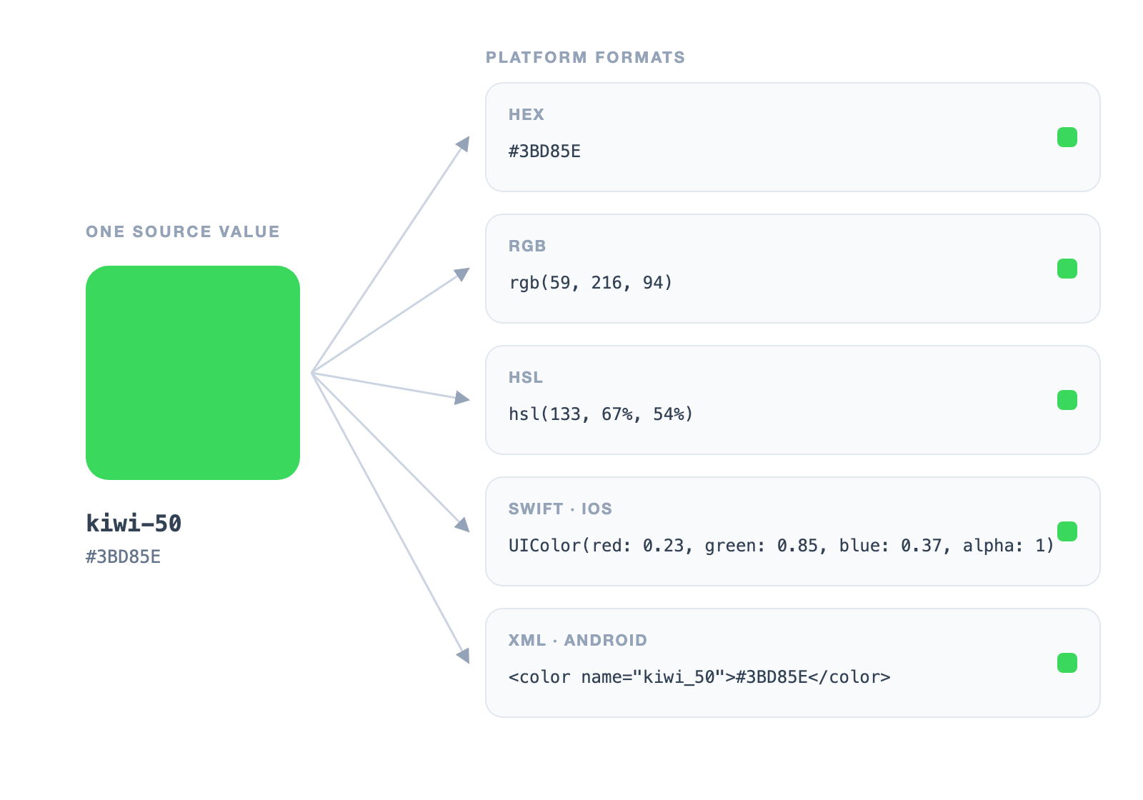
Centralized storage and programmatic transformation. By storing design values in a repo or a database rather than scattered across design files and codebases, we gained a single source of truth. More importantly, we could apply transformations programmatically - converting a single color value into the specific formats needed by different platforms, generating aliases, and applying systematic adjustments like accessibility-compliant contrast ratios.
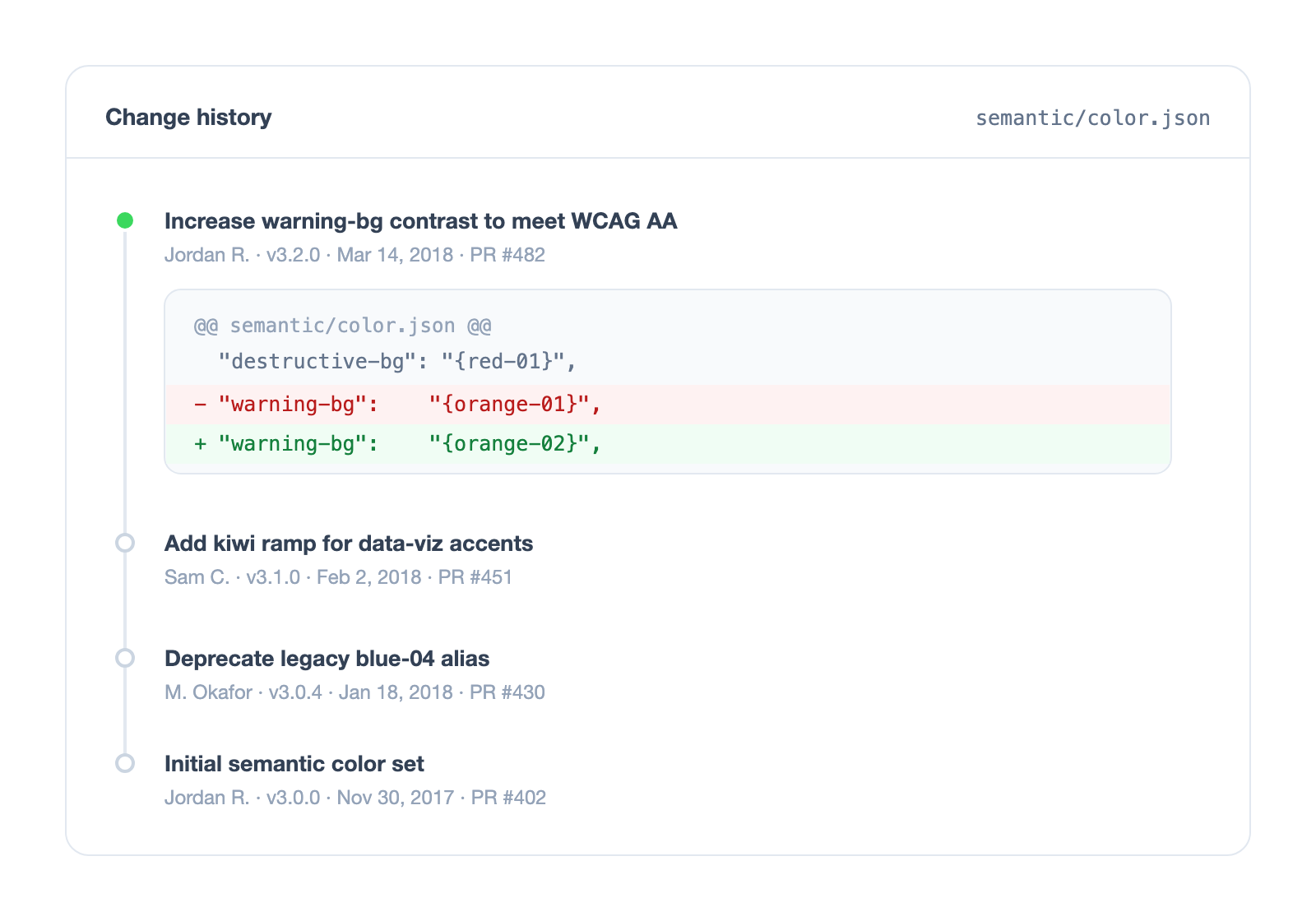
Version control and change tracking. Every design decision could now be versioned just like code. We could track who changed what and when, compare versions over time, and understand the evolution of our design language. This brought the rigor of software development practices to design system management - including the ability to roll back problematic changes.
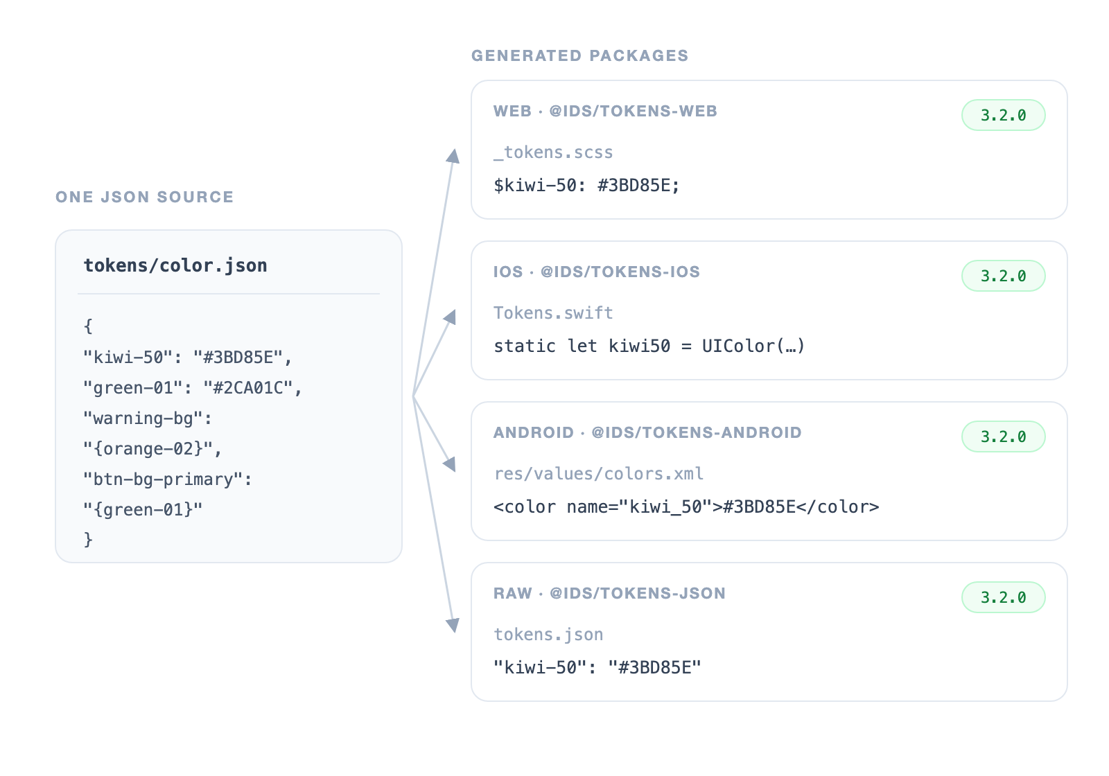
Multi-platform code generation and automatic distribution. From a single source, we could generate platform-specific code packages - CSS variables for web, Swift constants for iOS, XML resources for Android - and distribute updates through package managers. When a design value changed, every team across the organization could receive the update simply by bumping a version number, rather than manually updating hardcoded values.
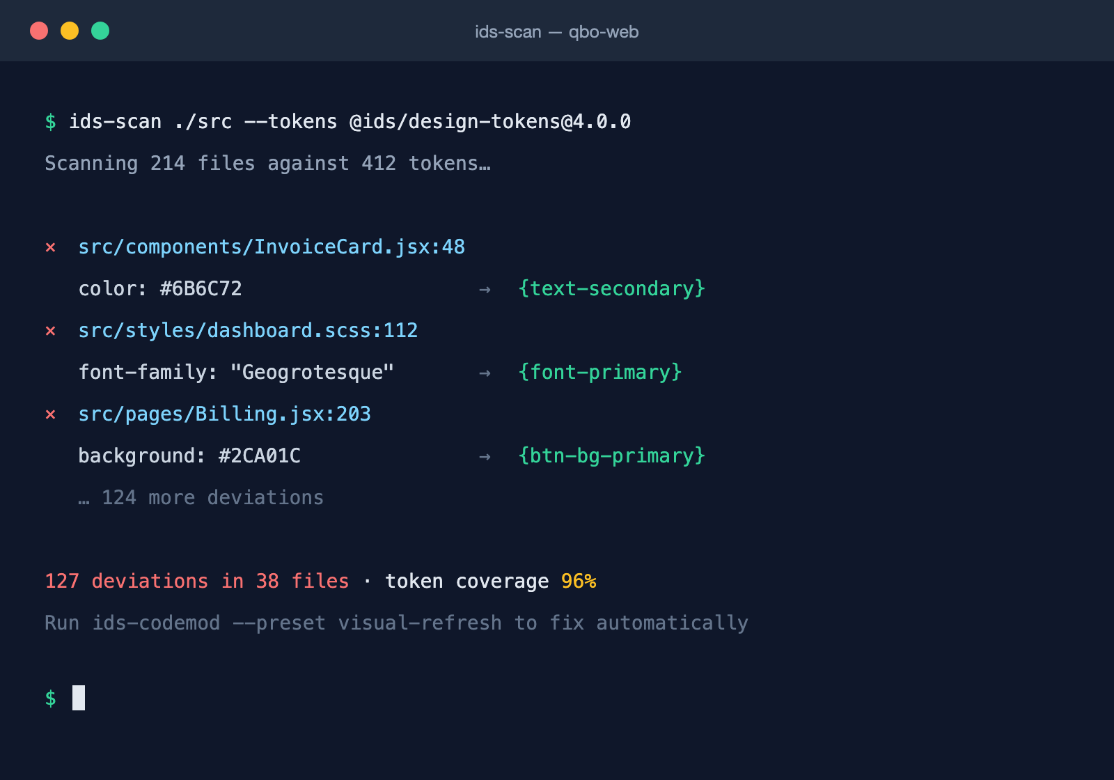
Build-time observability and compliance. With design values defined as data, we could analyze codebases at build time to detect deviations from the design system. Teams could see exactly where their code used hardcoded values instead of tokens, or values out of compliance, enabling targeted migrations and measurable compliance tracking across the organization.
Architecture
JSON-based design tokens with multi-platform transformation
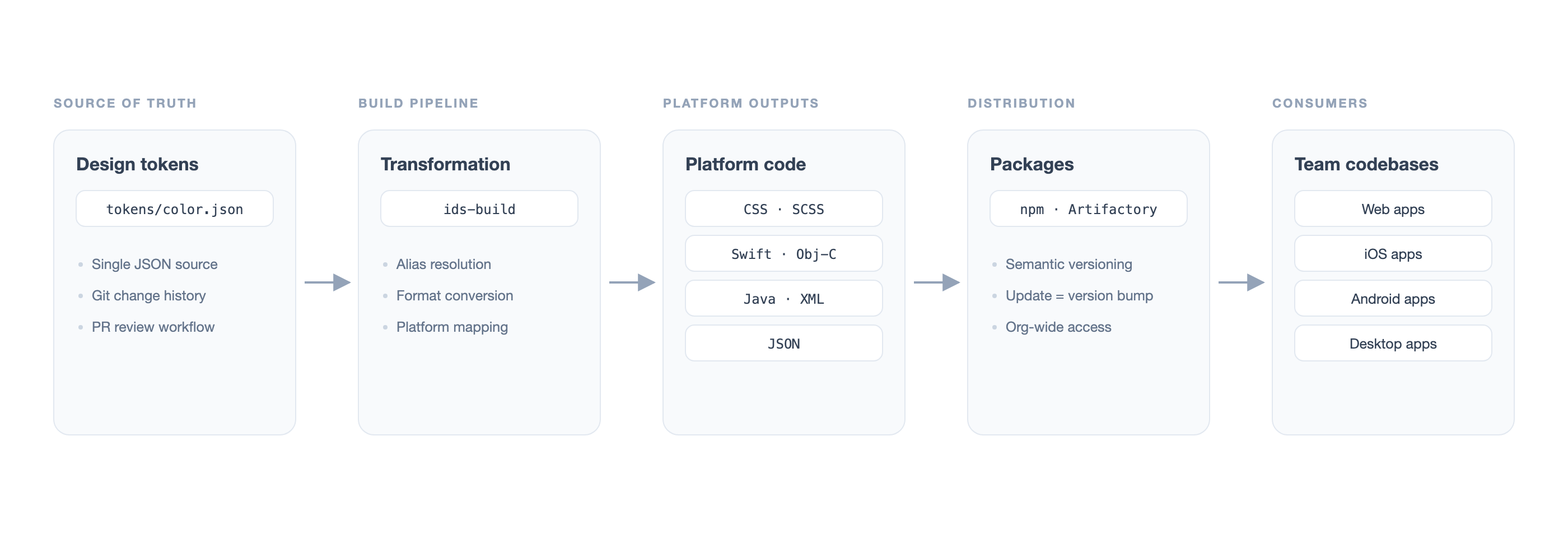
When we first launched the design data management system, it was kept in a GitHub repository as JSON. Developers with control of the repo could change, add, or remove values through standard Git workflows.
The JSON was transformed into various code packages: JSON (raw format), CSS and SCSS for web styling, Objective-C and Swift for iOS, and Java for Android applications.
These packages were distributed through our internal Intuit NPM server and later Artifactory. Teams across the company could import and include these packages in their source code.
The first version was a success and was adopted over time by teams around the company, especially the design systems teams. This established the foundation for treating design decisions as versioned, distributable assets.
Innovation
Three-tier naming system for flexible design governance
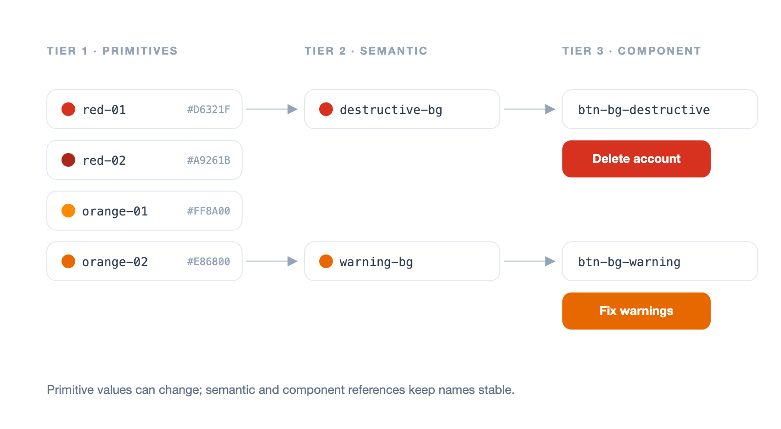
One key innovation was storing values in their most abstract form and using variable names as references to connect through multiple layers of semantic meaning.
This hierarchy enabled flexibility to change underlying values without breaking references, provided clear semantic meaning for designers and developers, and enabled systematic updates during visual refreshes.
Tier 1 - Primitive values:
red-01, red-02, orange-01, orange-02
Tier 2 - Semantic names:
destructive-bg, warning-bg
Tier 3 - Component-specific:
btn-bg-destructive, btn-bg-warning
Evolution
Enabling designers to participate without GitHub
The initial system required GitHub access and technical knowledge to make changes. While this worked for developers, it created a barrier for designers who wanted to participate in managing design decisions.
We developed a custom web application for managing the design data, allowing designers to participate directly without having to learn Git or navigate pull request workflows.
This broadened participation in design system governance and enabled self-service capabilities for design system consumers across the organization.
Governance
Design system governance and adoption accountability
As adoption grew, we added a management layer for proper design system oversight. This included governance features for approval workflows, ensuring changes went through appropriate review before affecting production systems.
We implemented adoption tracking and accountability metrics, team ownership and responsibility assignment, version control with complete change history, and rollback capabilities for design decisions.
This governance layer was essential for maintaining consistency and quality as the system scaled across the organization.
Application
QuickBooks ecosystem visual refresh (2018)
Font Migration
Removed Geogrotesque, a font that was previously prominent across all products, and replaced it with Avenir Next as the primary font family.
Color Palette
Migrated to an updated brand color palette, systematically updating color values across the token hierarchy while maintaining semantic relationships.
40+ Components
Updated over 40 UI component designs across the ecosystem. The token infrastructure made these sweeping changes manageable and trackable.
Observability
Identifying and resolving design system deviations
We built an observability management system that leveraged the design data infrastructure to help teams understand and resolve deviations from design system standards.
Build system integration: The system tapped into web app build systems to analyze compiled code and identify where it deviated from our color palette, font settings, and other visual aspects.
Team-specific dashboards: We created dashboards that provided individual teams with knowledge of where their code deviated from design system values and how they could migrate their code to properly follow the guidance.
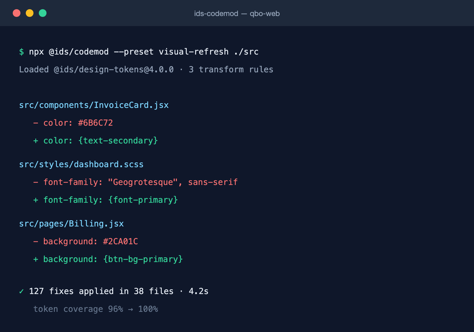
Code-mod tooling: We also wrote a code-mod for local code modification that developers could use to very quickly make the necessary changes automatically.
Rather than requiring developers to manually hunt down and update every instance of a deprecated color or font, they could run the code-mod and have it systematically update their codebase to align with the design system.
This combination of observability and automated remediation dramatically accelerated the visual refresh migration and established a pattern for future design system evolutions.
Legacy
A decade in production, and a bet the industry made as well
The prototype I built in my first weeks on the IDS team established systems still running at Intuit today after multiple visual refreshes, a generational shift in design tooling, and the steady growth and evolution of the design systems it serves.
The bet was validated well beyond Intuit. Design tokens went from novel idea to industry default: a W3C community group is standardizing the format, Figma built variables directly into its core product, and open-source pipelines now do what we had to build ourselves by transforming one source of design data into every platform's native code. What was new in 2016 is standard practice today.
I believe the most important chapter is still ahead. A design system expressed as data is machine-legible — and the newest readers of that data are AI models. This is where the semantic layer earns its keep a second time: a token like destructive-bg tells a model not just what a color is, but what it is for. What we designed as a naming hierarchy for human clarity turns out to be a vocabulary of intent for machines.
I think a vocabulary is what generative UI will run on in the near-term. When a model assembles an interface at the moment of use, no one is there to review it — the design system itself has to keep the output on-system, and it can only do that with structured, semantic design data. This way design decisions can flow as governed data to every platform, including generative UI systems.
My colleague Kelly Harrop told the story of this work on stage at Figma Config 2022: